I really enjoyed this weeks task as I genuinely enjoy Graphics. I think I did well in all of my task and think I learnt stuff and just recapped on things I already knew this week. I'm happy we did more manual things with our hands than computer based as I did more hands on stuff in Graphic in college. Although it would be nice to learn more computer based Graphics in the future as I just know the basics. I'm sure if I pick Graphics as my pathway (which I most likely will) we would do computer based things which i'm looking forward to.
Monday - I liked this lesson the most as I really like experimental work, (images 1 & 2) and making collages is one of my favourite things to do them in my own time aswell. I think the work I produced was good even though we had to use different sense and not the usual. I think the collage I produced was successful as I used a mixture of colour and b&w images to create different dimension. I also think ripping pages gives collage more texture and realness. I think the painting I had to produce from a 3cmx3cm viewfinder worked well as I used a mixture of colour. I didn't find this day challenging which is a good and bad thing as I was used to this kind of work from college. I learnt from this day that experimental work is always good thing in creating work.
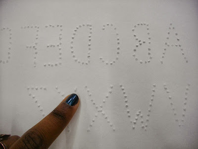
Wednesday - This was my least favourite day but I still enjoyed it none the less. I'm not really into typography as I don't think it's one of my weaknesses in Graphics. To me typography needs to be a neat and I don't think I have that neatness by working by hand. I think I may be a bit better with typography on the computer as it's easier to do on the computer and looks a bit neater. I still had a go at it though! At first I didn't think my alphabet font (image 4) was much of a success as everyone else in my class looked more bold, colourful and neat. But after we had to present our fonts to the class and Andy talked about mine I felt it wasn't that bad as it influenced touch as it wasn't clear to see at first. This got me to think about how a blind people see typography. This day I learnt to not to cut things off if you don't think your good at it at first and to not scrap your work if you don't like it and to just keep going because it might end up better than thought or you could develop it into something better.
Friday - I thought today's task was good but it was a bit long. We had 3 hours to produce our work which I finished in about an hour and a half but the I guess the extra time was good as I could develop my work in my sketchbook. At first I thought my plan in my sketchbook (image 5) was poor as I was a bit confused on what to produce at first but I guess that's what a plan is for, to develop it into something better. Andy discussed on planning on a small scale first as it saves time and it quick which was good advice to recap. To begin with I thought my final piece was a bit boring and bland as I didn't have the right the materials I wanted to use (drawing inks) but I didn't give up and just decided to keep on going by layering pencil, markers and stencils. I don't think it turned out to bad in the end, if I may say so myself. I think that if I did it again I would use ink and make the eye more darker so my cut outs would be more prominent. Overall I learnt that its good to plan even though it can be boring and tedious and development is most key in everything.


No comments:
Post a Comment