Monday 18 November 2013

Industry Project : Invites

Here are some sketches of potential invites for the catwalk show:


I've decided to laser cut the invites into acrylic as many of Katrantzou's past invites are unique and have a personal touch. The invites are inspired  by a  Greek tablet, I wanted them to have a substantial feel that could kept and become a piece memorabilia.

These are the designs I have created on Illustrator to laser cut tomorrow. The sections in black will be engraved and the sections in red will be cut out:

Front
Back


Industry Project : Logo

Here are sketches of the collection logo:


These are developed logos I made on Illustrator:


This is the finished logo for the adverts. The colours would be black or white depending what the logo is place on. I kept it simple by using a similar font to Katrantzou's logo but our collection name in a handwritten font to give it a personal touch.

This is the logo that will be shown on the projection on the catwalk. the image within the font will move and change to the prints and colours within the collection.
Here I have added the final logo to my campaign examples:


Industry Project : Campaign and Lookbook

For the adverts and the lookbook I wanted to keep the theme of the prints being the main aspect of the collection. These are some example of campaign images I made using my print examples and some of Katrantzou's past models to show how the layout of the page.


I then decided to see how I would show the Designers chosen garments in the presentation so I drew two sketches and added them to my advert examples:


These are photocopies of my advert example which I then drew different designs on top of to illustrate how the Designer's designs could be shown:

Industry Project : Prints and Catwalk

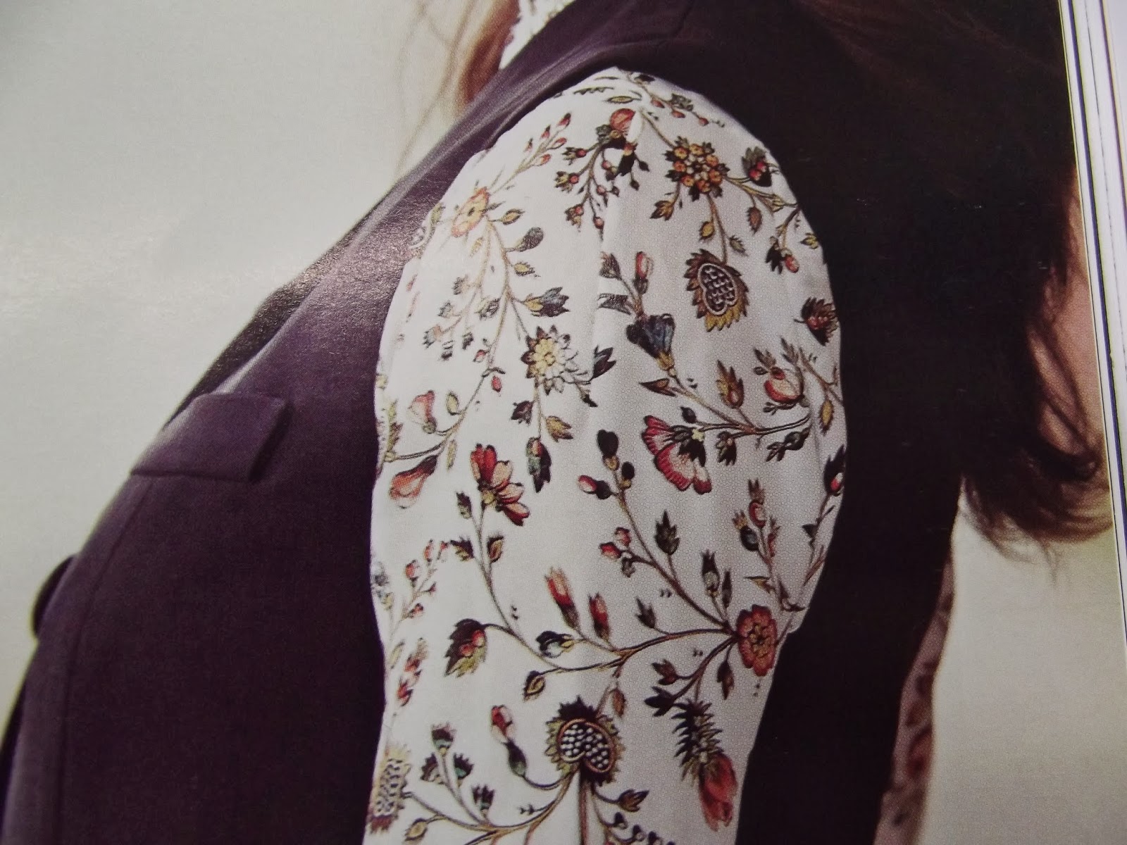
As Mary Katrantzou's garments are heavily print design the whole team depends on the Textile Designer's but while I wait for the prints I decided to make my own as an example for the overall product.

These are the prints I made:


I then started thinking about the catwalk, I want to make the prints the main subject so I came up the idea of using a projector. I'm thinking a projecting prints onto the garments so the model becomes lost in the print and become like a watercolor painting.

These are some plans I made for the catwalk projection:


I got the inspiration from a Wild Belle video:


I then started to experiment with my print and the projector on the mannequin:


This is one of the examples
I also got Rebecca one of my group members to model for me as an example of how I want the finished idea to look like:


I then decided to go on Photoshop and make examples of how I want the projection to look like on the catwalk:


After I decided where the location of the catwalk show (the British Museum) would be and recieveing some of the actual prints from the Textile Designer I decided to create the final catwalk layout on Photoshop:


Industry Project - Week 1

Our project for the next 2 weeks is become a fashion house as a certain brand has disappeared/died. I have been put into a group of seven each of us having a role to create a overall collection. My fashion brand is Mary Katrantzou. The team consist of 2 Designers, 2 Textile Print Designers, 1 Accessories Designer and 2 Fashion Promoters. In the team I am the Fashion Promoter  and my role is to cover the campaign, lookbook, invites and catwalk.

This is some research I did before. I noticed the Katrantzou's prints reminded me of a stain glass picture and I decided to try a replicate that in my campaign and catwalk.Katrantzou's print colours also reminded of a watercolor painting and the shapes like Gustav Klimt's paintings. I'm keeping these aspects in mind to use throughout my work.


In my group we decided to base our collection on opulence vs urban as we wanted to keep Katrantzou's Greek origins in our collection but to also include London as our culture. We also were given two quotes to work from, we decided to use on of the quotes which was,
There are massive gaps in this essay, it is broken and re- wound, not always knowing and yet searching. Respond. Exchange. Converse. Be a traveler in this novel. Even if only for a while. 
 As a group we decided to pick up on the words 'massive gaps', 'broken' and 'traveler', as we thought Katrantzou's prints have gaps and are broken in places. We also picked up on the word traveler as we knew Katrantzou often uses her heritage in her work and thought it was a good fit.

Developing concept

Thursday 7 November 2013

Development - Day 2 (continued)

After break we started designing garments out of a shape we chose to develop from. This task wasn't really linked to Fashion Promotion in anyway but it was still useful to get an insight into Fashion Design and it was good to have some extra drawing practice.

I started with this shape, it was a bit of a complex shape to work from:


Then we had to create draw as many collars, sleeves, trousers, skirts and jackets; each page taking 10 minuets.

Collar
Skirt
Trouser
Sleeve
Pockets
Jacket

After designing as many design as possible within our time limit we then had to pick one design from each page and develop it into five new designs as a collection. This is how I got on:


After our collection was complete we had to add them to a model, with a front and back view:


Development - Day 2

The first task of the day was to go around the Uni and outside and find interesting patterns and textures on clothing. Icouldn't find much interesting pattern and textures on clothing so I decided to expand my patterns and textures to things within the O2 like chair covers and wall decorations. This task open my eyes even more as I never really noticed the great patterns of chair cover!

These are clothing patter and texture I liked:


These are other print and textures I found and like:


 I also looked through some magazine: